Work

St. Anthony of Padua Horizon Campaign
St. Anthony of Padua Catholic Church in The Woodlands, TX, reached out to Sherwood Fellows to develop a brand image and website for Horizon—a capital campaign to expand St. Anthony of Padua’s campus for the present and the future. I was brought onto the team to help develop the campaign’s brand guide and bilingual website.

OSV Innovation Challenge
I was invited onto the Sherwood Fellows team to head up the visual branding and web design for one of their client projects: The OSV Innovation Challenge. We landed on a gritty, black-and-white, double-exposure photography-heavy style marked by bright pops of yellow and bold typefaces.

Catholic Women’s Conference - Diocese of Austin
The Austin Catholic Women’s Conference is an annual day of fellowship, formation, and prayer for the women of Central Texas to receive rest, encounter and respond to the Lord, connect with community, and be equipped for evangelization.

Heartbreak City Stripped
From its early beginnings playing free shows at hole-in-the-wall Cheatham Street Warehouse to opening for Bob Seger, Blue Water Highway has taken center stage in the Americana music scene. The moody album design we ended up with for their newest record echoes the bluesy, natural, and intimate sounds of Heartbreak City Stripped.

CEDE: Catholic Entrepreneurship & Design Experience
It’s easy to make a brand that’s pretty and plays it safe; and it’s another thing entirely to push the boundaries of what’s “normal” to achieve something truly new and unique. That requires boldness, courage, and a willingness to take risks. Since CEDE plans to invite students to do the same, it’s fitting that their branding reflects that.

St. Patrick Catholic Parish
St. Patrick Catholic Parish of Brighton, MI reached out to Sherwood Fellows to develop a brand image and website for the church. I was brought onto the team to help develop the logo, branding assets, and brand guide for the parish, which I was then commissioned to apply to their website design as well.

Catholic Answers
Catholic Answers is the world's largest database of answers about the beliefs and practices of the Catholic faith. While the Catholic Answers had their own web developer already, they needed someone to design the look and feel of the new site, taking it to the next visual level while working within the parameters of their existing branding.

Radical Love, Radical Mission
The Catholic Diocese of Dallas was in need of a report to share the results of their Convocation on Youth, Campus, and Young Adult Ministries and Vocational Discernment. The theme and title of the publication was Radical Love, Radical Mission: Being bold and creative in response to the pastoral needs of youth, young adults, and families in the Diocese of Dallas.

The 635: Mirror, Mirror
The mission of the 635 is to provide young adults in the Dallas area, regardless of their faith backgrounds, with an undeniable sense of belonging, a safe space to encounter God, and access to a supportive Christian community. In association with Sherwood Fellows, I helped develop the theme and designed a poster for The 635’s 2018 fall series: Mirror Mirror—in which six young adults get real about social media, comparison, and each other.

Beaudry Hometown Insurance
Beaudry Hometown Insurance was in the process of being passed down from one generation to the next—the third, to be exact. With that transition, the company was in need of a rebrand: one that would identify what set it apart from its competitors and communicate that reality visually to its insureds.

Sherwood Fellows
Sherwood Fellows is a creative agency that helps brands create the tools, stories, and community that will make their mission a success. After working with them on various collaboration projects, I was thrilled when they asked me to head up their website redesign.

Catholic Family Life Symposium
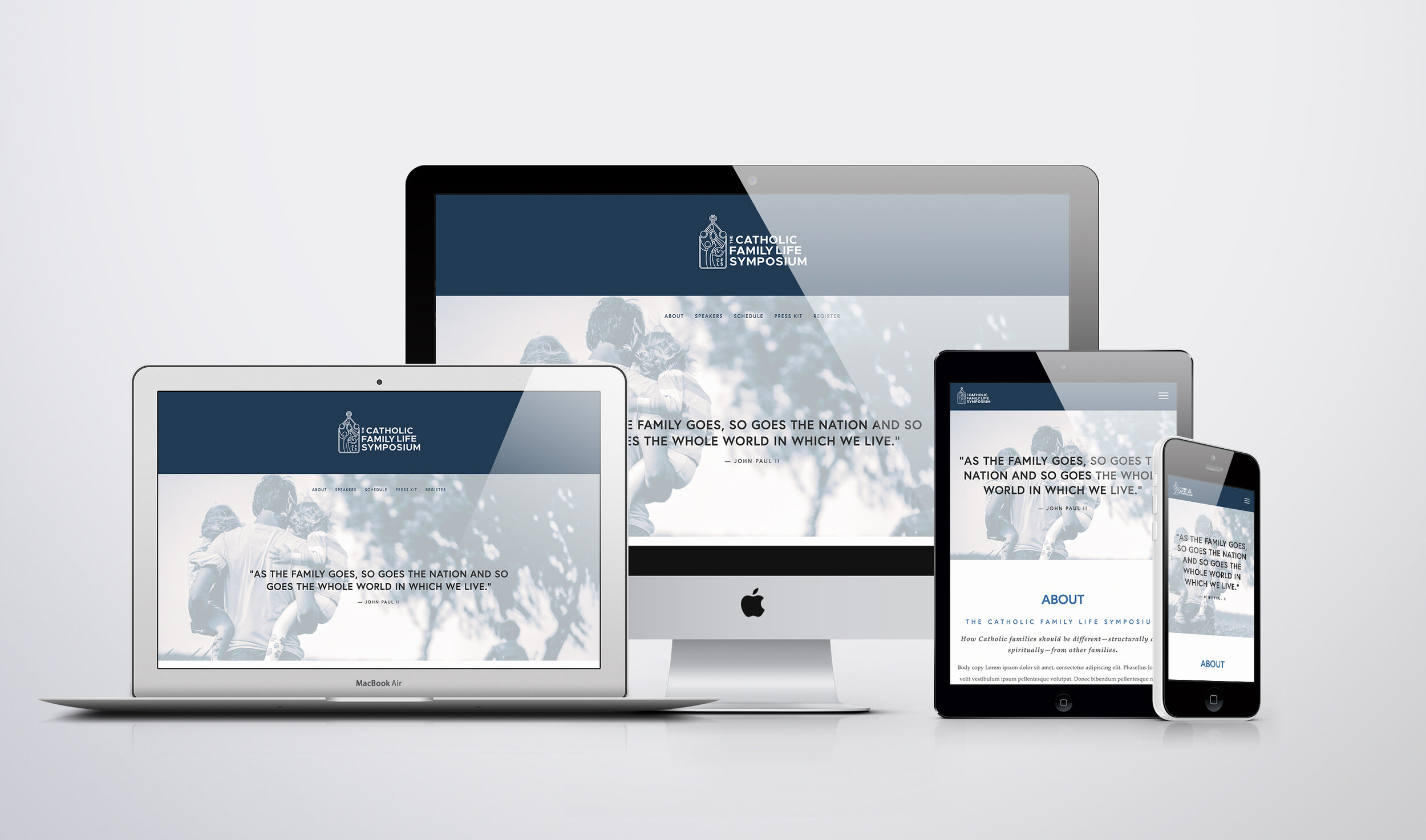
The Catholic Family Life Symposium event hosts were in need of a website that was academic, professional, edgy, and dynamic, where press kits and the event’s speaker information could be found.

Grand Ol’ Christmas Show
The Grand Ol' Christmas Show is a tribute to the original, traditional, one hundred-percent, red-blooded, two-fisted, all American old fashioned Christmas Show… and it needed a website makeover.


CATI Armor
CATI Armor – manufacturer of the world's most ergonomic multicurve AR500 and AR600 steel core body armor – needed a logo redesign that could be used as a stencil to spray paint their products with.

Essence: Assault on the Mind
Essence: Assault on the Mind is the first of a science-fiction crime novel series following FBI Agent John Rocco. In this episode, Rocco faces a dangerously brilliant neuroscientist who has managed to breach dimensions with his mind, and plans to use an app called eTelepathy for widespread mind control.

Loomis Academy
I can't count the times colleagues and coworkers have made comments along the lines of, "I never would have guessed you'd been homeschooled, you're so... normal." My parents wanted a logo and brand that would set them apart from the stereotypes and show that their kids did, in fact, get a good and proper education.

Primordium, A Novel
The truth is, people do judge books by their covers. You can have an extremely well-written, engaging story—but if its formatting screams "amateur," people will assume the content is, too. Good books deserve good design.

Amado Gonzalez
It’s hard not to love your job when it involves supporting the individuals, businesses, and bands that matter to you. I had the wonderful opportunity of designing a logo for Amado Gonzalez on the verge of his debut album, “Despite the Distance.”

Mario Loomis, Author
On the verge of publishing his second novel, Primordium, Mario wanted to take his writing to the next level with an author website. He needed something sleek that encompassed his genre and style, and I believe we found it.
