Full Armor Band
Cover Art & Album Design
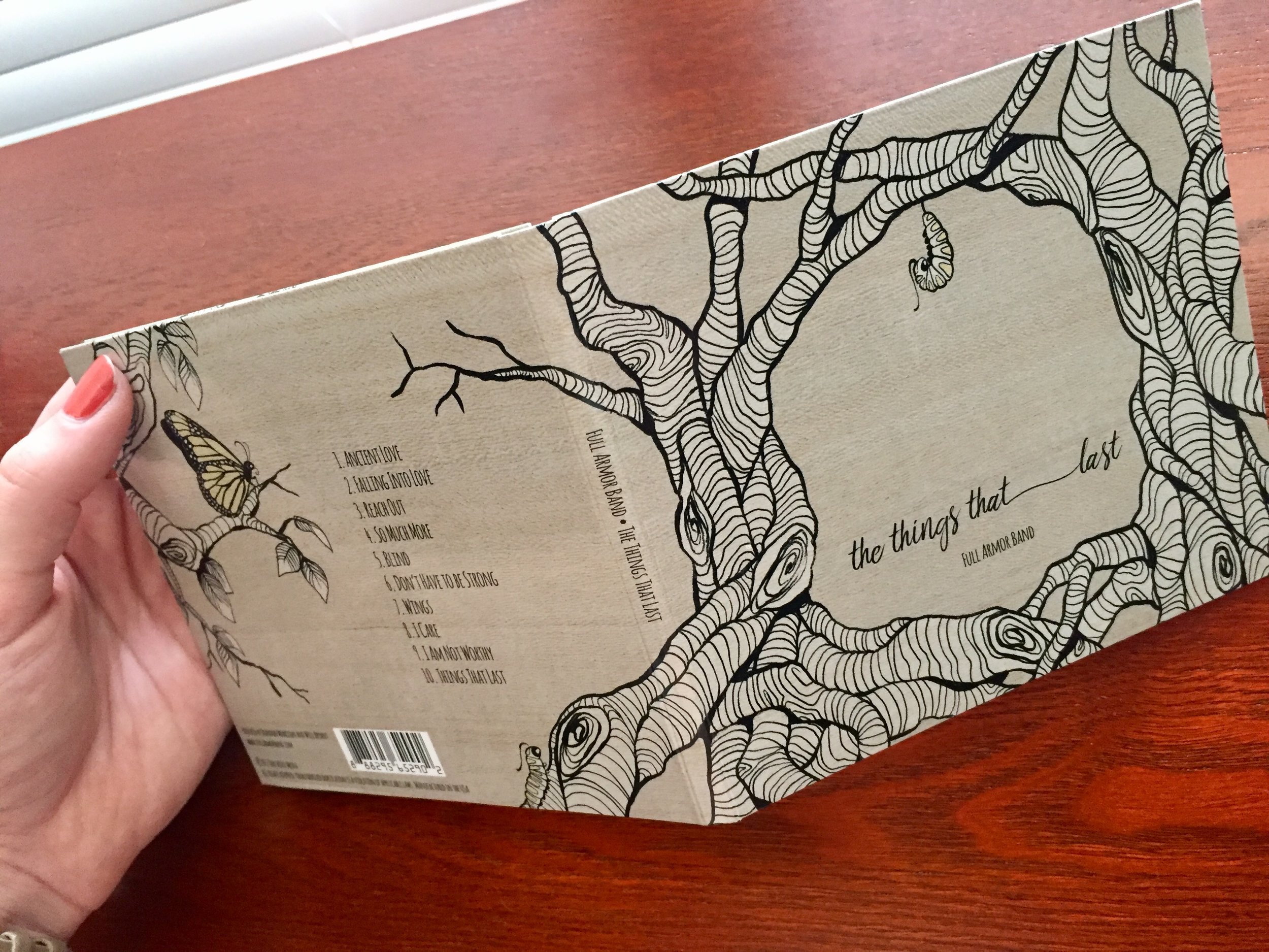
Full Armor Band's new record, The Things That Last, marked a new season for the band. It was the first time they'd collaborated to write all the songs together. This label really needed to stand out from the rest.
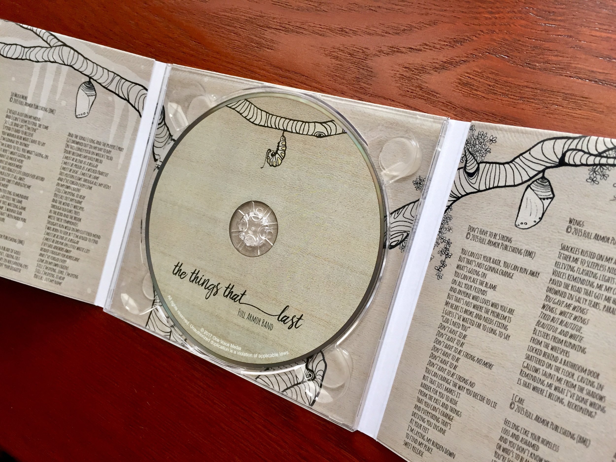
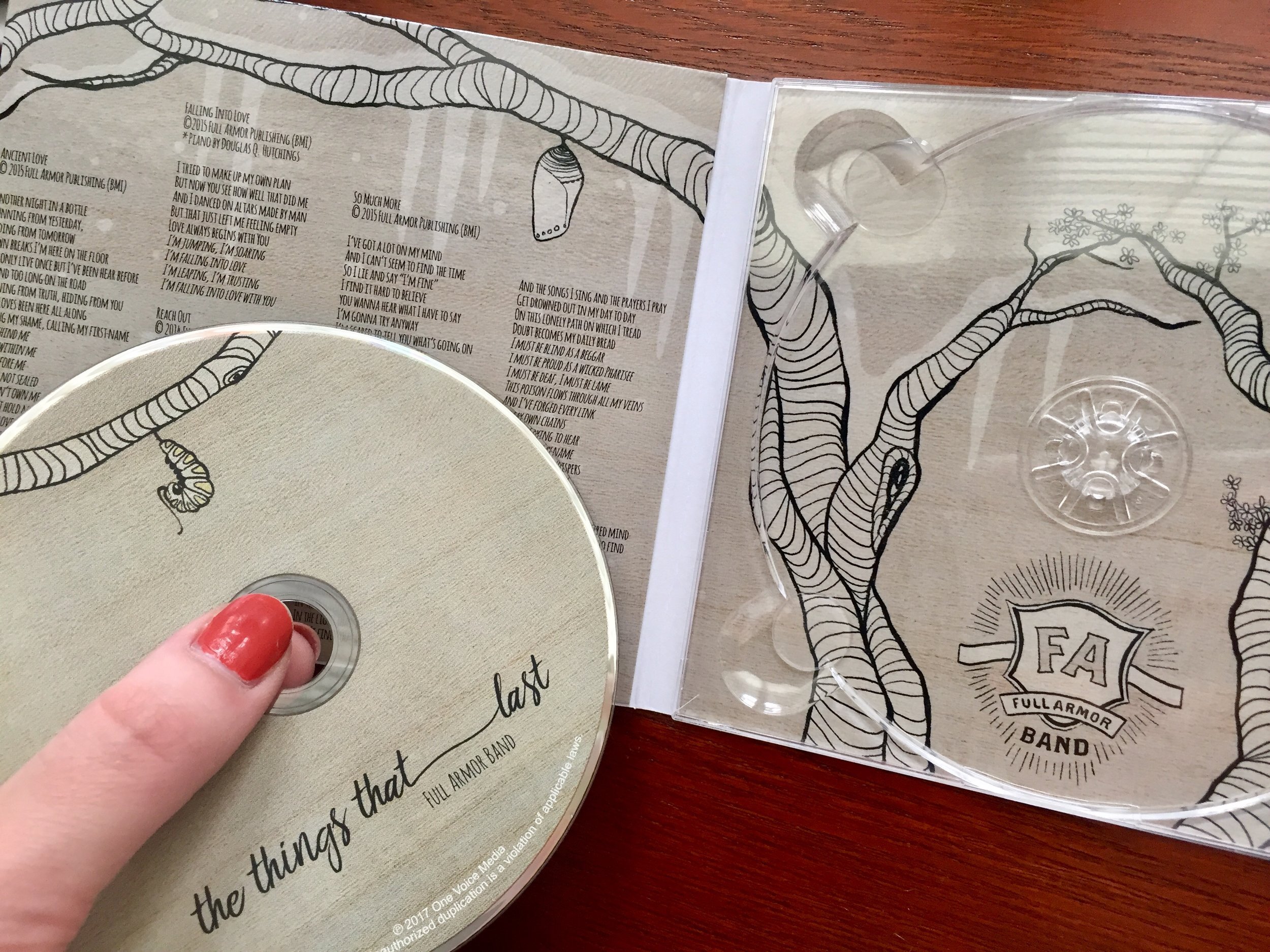
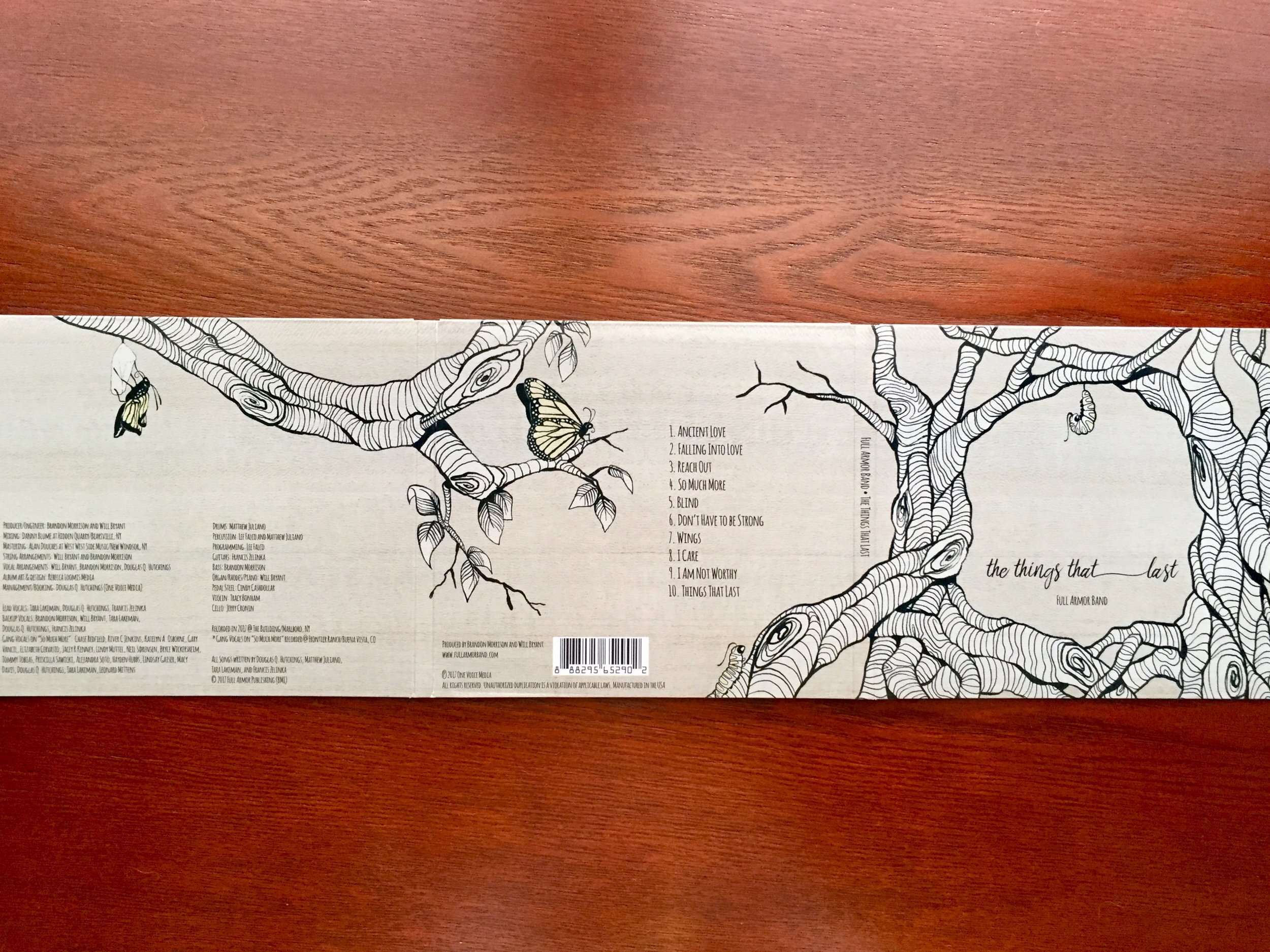
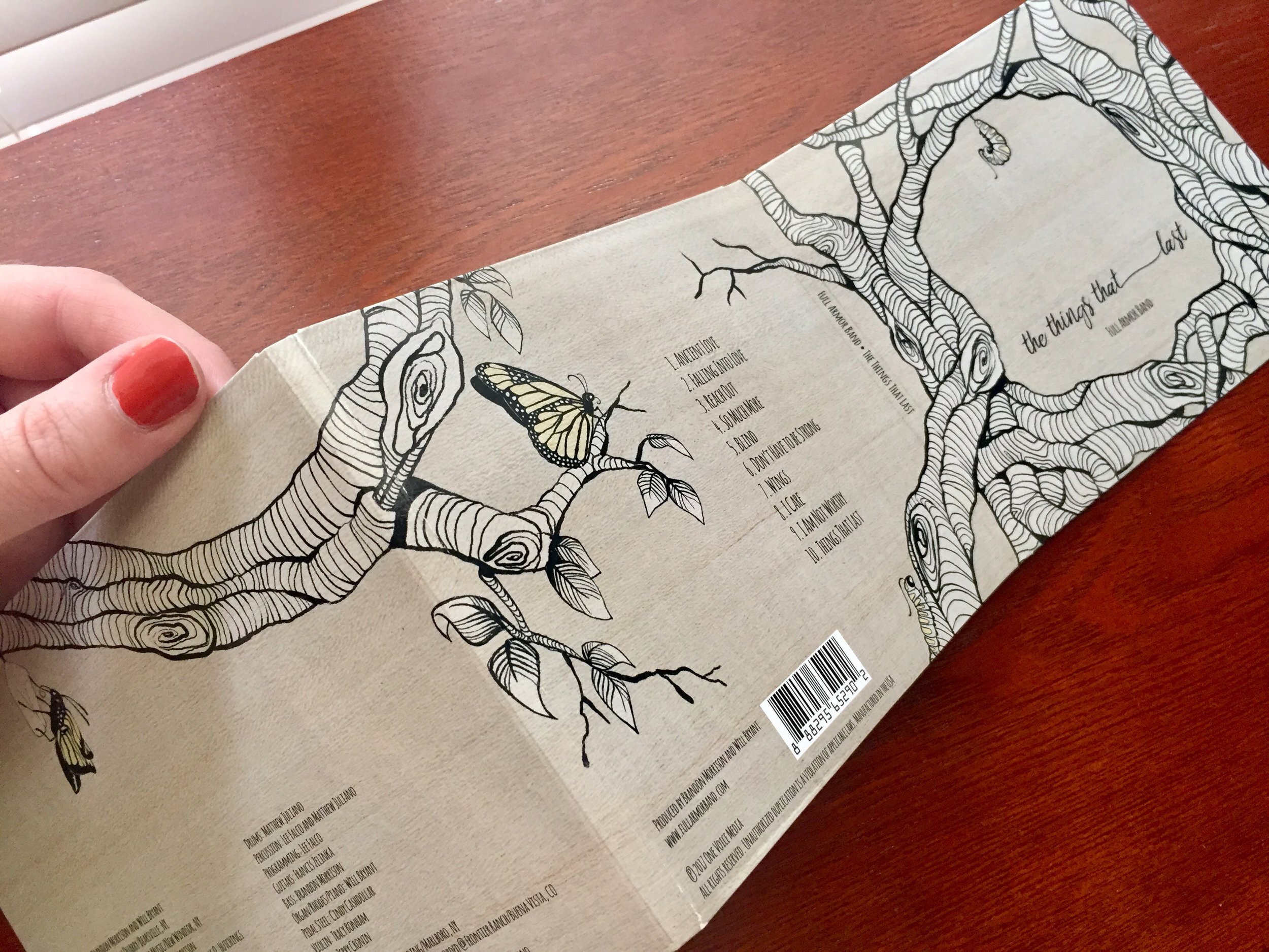
When Full Armor Band first had me listen through the album, I was struck by how beautifully the songs take the listener on a journey through the various seasons of life. The band members' own personal growth shone in the lyrics and style of the songs, which seamlessly painted a picture of growth that anyone could relate to. These themes of seasons and growth were key ingredients for the album artwork.
I used the classic butterfly imagery to depict growth. Each panel of the digipak shows the chrysalis in a different stage under different weather. Just as the songs move through a gradual transformation, the artwork is one seamless piece across the entire case, moving from one season to the next.
In addition to spacing the artwork so it would align perfectly to each panel, one of the challenges I faced was developing graphics that could be rearranged for use in marketing materials. I approached the project the same way I would branding. Everything had to match so that Full Armor fans would recognize any material relating to the record on sight.
Everyone in the band was happy with the end result, even the members who claimed to be more critical. The digital promos were used throughout their social media and on their website to increase pre-orders. Immediately after the album's release, Full Armor was selling a ratio of 1 sale per 4 concert attendees: much higher than the industry's standard of 1 out of 10.
“Rebecca is extremely creative and manages her business dealings in a very professional way- a rare combination. She understands marketing/branding and how to bring her clients vision to fruition. Looking forward to working with her again. Highly Recommend.”
—Douglas Hutchings Jr.

